



Adobe Photoshop: Photo Editor is the kind of photography app that makes a strong first impression because it puts serious-looking editing ideas on a phone. I can adjust color, combine images, remove unwanted objects, and build more attention-grabbing visuals without moving to a desktop editor. After spending time with it, though, my opinion is more specific than “this is Photoshop on mobile.” It is a capable creative tool, but its lasting value depends on whether you regularly need layered-looking visual work or only want quick improvements to everyday photos.
Adobe develops the app, and it is available as a free download for everyone. The free entry point makes it easy to test without committing money first, while in-app purchases range from $4.99 to $499.99 per item. That large range is worth noticing before you build a serious workflow around it. I would install it to explore the editing experience, but I would also decide early which tools I actually use before considering any purchase.
From an exciting first week to a useful long-term habit
Why the first sessions feel productive
During the first week, the strongest appeal is the feeling that a phone photo can become something much more deliberate. A dull image can receive a more controlled color treatment, a distracting detail can be removed, and separate images can be blended into a single composition. Those tasks are more ambitious than applying a preset and moving on. They invite experimentation, especially if you enjoy making social graphics, profile images, posters, collages, or visual concepts rather than simply correcting exposure.
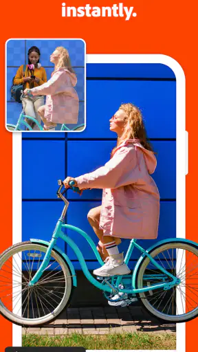
I found the app most interesting when I started with a clear visual problem. For example, imagine taking a photo of a friend at a café and noticing a bright sign, stray object, or messy background competing with the subject. Instead of cropping away half the frame, I can work on the distraction and then adjust the color so the subject and surroundings feel more unified. That process takes longer than using a one-tap editor, but the result can preserve the original composition.
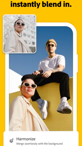
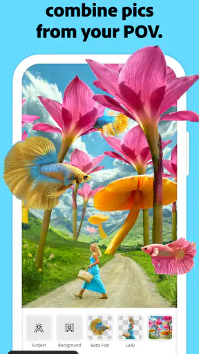
The same applies to blending. A travel photo can become a small announcement graphic by combining it with another image, while a product photo can be placed into a more imaginative scene. I would not use this approach for every picture in my camera roll. I would use it when the image has a purpose beyond memory keeping and needs to communicate an idea.
The first-week advantage is creative control, not speed. If your main goal is to brighten a dinner photo and share it immediately, a simpler editor may feel better. If you want to make a visual that looks intentionally assembled, Adobe Photoshop: Photo Editor gives you more room to shape the result.
Small workflows that reveal its real strengths
One useful habit is to separate correction from invention. I first make the photograph readable by handling color and distracting elements, then I decide whether it needs another image or a more dramatic treatment. Doing everything at once often produces an overworked result. Keeping those decisions mentally separate makes the app easier to control, especially on a small screen where several edits can quickly become confusing.
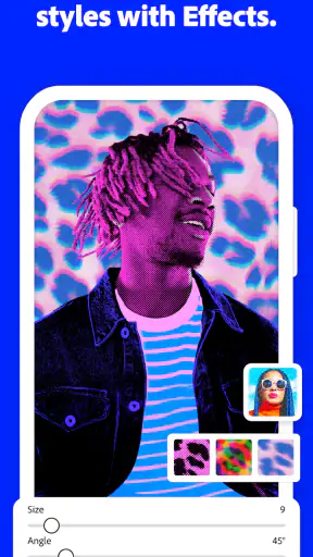
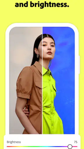
Another practical workflow is to duplicate an idea mentally before making a bold change. I might try a strong color direction for a poster-style image, then compare it with a calmer version rather than assuming the most dramatic edit is the best one. This is particularly helpful with portraits. Skin tones can become unnatural quickly when color adjustments are made for impact instead of balance.
Object removal also rewards restraint. It is tempting to erase every imperfection, but a photo can start looking artificial when the surrounding texture does not support the change. I use removal for clear distractions and leave harmless background irregularities alone. That trade-off is one reason I see the app as a creative editor rather than an automatic cleanup button.
For blended images, I recommend choosing source pictures with compatible lighting before trying to force them together. Two attractive images can still look wrong when one is warm and softly lit while the other is cold and sharply contrasted. The app can help with color, but it cannot replace the visual judgement needed to select suitable source material.
Who will enjoy the learning curve
The app suits people who like learning through repeated attempts. A casual user may understand the basic purpose quickly, but getting consistently convincing results takes practice. I would recommend it to creators who make content for social platforms, students preparing visual presentations, small-business owners creating promotional imagery, and photographers who want more control than a filter-based editor offers.
It is also a good fit for someone who already thinks in compositions. If you naturally notice negative space, color relationships, background distractions, and the direction of light, the tools become more rewarding because you already have decisions to make. The app gives those decisions somewhere to go.
I would be more cautious recommending it to someone who wants a purely automatic experience. It is not the app I would open when I have hundreds of holiday photos to process quickly. Nor would I choose it as my only tool for professional desktop production, where a larger display and a more expansive workspace can matter. On a phone, precision and organization eventually meet the limits of the form factor.
What remains valuable after the novelty fades
The month-to-month question is whether the app becomes part of a repeatable routine. Its recurring value is strongest when you have recurring visual tasks. A person who regularly prepares thumbnails, announcements, collages, product images, or campaign variations can return to the same core actions and improve with practice. The benefit is not just having many tools; it is becoming faster and more confident at a particular kind of work.
For me, the most sustainable use is project-based. I might keep it available for a weekly visual task, such as preparing a clean image for a community event or adapting a photograph into a simple announcement. That is more realistic than expecting myself to edit every image with the same level of care. The app earns space when it solves a repeated problem, not merely because it can produce an impressive result once.
There is also value in using it as a finishing tool. I can begin with a photo taken on my phone, make a targeted correction, remove one obstruction, and create a version sized for a particular purpose. This focused workflow is less tiring than trying to reinvent the image from scratch. It also helps prevent the common mistake of adding effects simply because they are available.
People who create visual content in batches may appreciate the ability to develop a consistent look through repeated color choices and compositional decisions. Consistency is often more useful than novelty. If every image receives a different dramatic treatment, an account or project can feel disjointed. I would use the app to establish a small visual language and then reuse that judgement across related work.
A realistic everyday scenario
Consider a local seller who needs a social post for a new handmade item. The original product photo may be attractive but contain a distracting cable, an uneven background, and colors that look flat under indoor lighting. I would use the app to clean the most obvious distraction, improve the color without changing the product’s appearance too aggressively, and blend in a second image or visual element if the post needs more context. The important point is that the app supports a short chain of purposeful decisions rather than one random effect.
That seller probably does not need to open the editor for every post. A simpler template or quick adjustment tool may be faster for routine updates. But when a launch image needs to look more considered, the app can justify its place. This is the pattern I see repeatedly: it is valuable at moments where presentation matters, while ordinary snapshots may not need its depth.
Maintenance is mostly creative discipline
The maintenance burden is not only technical. It is also the effort of keeping a workable editing habit. A powerful mobile editor can become cluttered in your mind if you open it without knowing what you want to change. I get better results when I define the task first: correct the color, remove the distraction, combine the images, or create a stronger visual concept. That simple preparation reduces wandering through tools.
Storage and organization also matter in practice. Blended compositions and alternate versions can multiply quickly, so I would keep only the exports I genuinely need and avoid treating every experiment as a finished image. A clean photo library makes the app feel lighter to use. Without that discipline, the creative process can turn into a pile of near-identical drafts.
Because the app is free to start, maintenance also includes watching how often paid options become relevant to your routine. I would not judge the purchase structure from one exciting session. I would first identify whether the free experience already covers my regular projects, then consider the cost of any feature I would use repeatedly. The listed in-app purchase range is wide enough that casual users and committed creators should approach that decision differently.
Keeping the application updated is sensible as well. The current version is 1.6.0.2299, and I would check that my device meets the minimum requirement of iOS or Android version 11 before planning a workflow around it. Compatibility is an easy detail to overlook when an app becomes part of a project deadline. A tool is only useful if it remains available on the device where you expect to work.
Where fatigue begins
The first source of fatigue is precision. Editing on a phone is convenient, but fine selections and delicate corrections can demand patience. Fingers cover part of the image, and a change that looks acceptable at one zoom level may appear awkward when viewed more closely. I can work around this by zooming in for detail and zooming out frequently to judge the whole composition, but that adds time.
The second is decision overload. Color, removal, and blending are each appealing on their own; together they can encourage unnecessary editing. I have learned to ask whether a change improves the message of the image or merely demonstrates that I found another control. That question is especially important for portraits and product photos, where authenticity can be more valuable than visual drama.
There is also a difference between making one attractive image and maintaining a consistent output. A single creative experiment can be satisfying, but repeated work exposes weaknesses in your process. If you need dozens of images with identical treatment, a dedicated batch-oriented workflow may be more efficient. I would choose this app for selective, hands-on editing rather than assuming it is the fastest answer to every production task.
Some users may also feel friction from the purchase model. The app costs nothing to download, but the presence of in-app purchases means the full experience may require a closer look at what is included before committing to a long-term routine. I prefer to test my actual workflow first. If the tool becomes essential, the decision is easier; if I only use it occasionally, a paid commitment may not make sense.
How it compares with familiar alternatives
Compared with a basic phone gallery editor, Adobe Photoshop: Photo Editor is more suitable when the image needs construction rather than correction. A gallery editor is usually the better choice for cropping, rotating, and making quick tonal changes with minimal thought. This app becomes more compelling when removing an object, combining imagery, or creating a visual with a specific purpose.
Compared with filter-first social apps, it gives me more control over the reason behind an edit. Filters can be enjoyable and fast, but they often push the entire image toward a preset mood. Here, I can make a narrower decision: change the color relationship, clean one area, or combine selected material. That control is useful when I want the subject to remain recognizable.
Compared with a desktop Photoshop workflow, the phone version is easier to reach but less comfortable for extended precision work. I would use the mobile app for ideas, quick client-style mockups, content preparation, and edits made away from a desk. For complex projects requiring a large canvas, careful alignment, or long sessions, a desktop environment remains the better choice. The mobile format is a strength for immediacy and a limitation for endurance.
Compared with a simple collage maker, it is better when the blend needs to feel intentional rather than decorative. A collage app may win when I want a quick grid of memories. This one makes more sense when the relationship between the images matters and I am willing to spend time refining the result.
Who should skip it
I would skip it if my photography needs stop at automatic enhancement, quick cropping, and occasional filters. Installing a more capable editor will not improve a workflow that does not require its capabilities. The extra choices can even make simple tasks slower.
I would also look elsewhere if I need a highly efficient system for processing a large collection of photos, or if my work depends on desktop-level precision every day. The phone is a convenient creative surface, but convenience should not be confused with unlimited workspace. A different tool may be better when speed, batch consistency, or detailed control matters more than portability.
On the other hand, I would keep it in mind for anyone who repeatedly turns ordinary images into purposeful visuals. The app has enough range to support experimentation without forcing every project into the same preset style. Its audience is not “everyone who owns a camera”; it is people who want to make visible choices about the final image.
My long-term verdict
Adobe Photoshop: Photo Editor earns lasting space on my device when I treat it as a focused creative workshop, not as a replacement for every photo tool I already use. The first week is exciting because the possibilities are easy to see. The following months are more revealing: the app remains worthwhile only if I have recurring projects that benefit from object removal, controlled color work, or image blending.
Its average rating is 4.5 from around 4K ratings, and it has passed 1M+ installs, which reflects broad interest in this mobile photography approach. Those figures do not decide whether it belongs on your phone, but they fit my own conclusion that the app is approachable enough to attract casual explorers while offering more depth to committed users.
The everyone age rating also makes it suitable for a broad audience, though suitability does not mean every person will enjoy the learning curve. I would recommend starting with one practical project instead of trying to master every possibility. Make a clean edit, compare it with the original, and decide whether the extra control saved you from a compromise you would have accepted in a simpler app.
My final recommendation is positive but selective. Install it if you want to create rather than merely adjust, and give yourself time to develop a repeatable workflow. Keep it if you find yourself returning for real projects, not just opening it to browse effects. If your needs are mostly instant corrections, choose the lighter alternative and avoid unnecessary complexity. For creators who want a portable way to shape images with intention, this is a free starting point that can become a dependable habit once the novelty turns into practice.


